We need to talk about the “Purple AI Slop”. 🟣
You know exactly what I’m talking about. You visit a new tech startup’s website or scroll through a marketing blog, and you are immediately hit with it:
- Glowing neon blue and purple lights.
- Shiny, metallic robot heads looking at nothing.
- Meaningless “digital brain” circuits floating in space.
- A hyper-realistic but soulless “Cyberpunk” aesthetic.
In the design world, we call this Purple AI Slop. It is the default look of lazy AI prompting. When you ask tools like Midjourney or DALL-E for a “tech background” without specific instructions, this is what they give you.
Why is this a problem? Because relying on Purple AI Slop makes your brand look cheap, generic, and lazy. It tells your visitors: “I didn’t care enough to create something unique, so I used the default settings.”
If you want to stand out in 2025, you need to eliminate this generic look from your visual identity.
Good news: You don’t need to be a professional designer to do it. In this guide, I will share 4 proven strategies to create unique, human-looking visuals and fix the Purple AI Slop problem for good.
Why Does AI Love Purple So Much?
Before we fix it, let’s understand why Purple AI Slop happens.
AI models are trained on billions of images from the internet. When it comes to “technology” or “future” concepts, the internet is flooded with sci-fi movies, gaming setups, and stock photos that use… you guessed it: Neon Purple and Cyan.
So, when you type a generic prompt like “Future technology background”, the AI takes the path of least resistance. It gives you the average of what it has seen. To break this cycle, you must force the AI out of its comfort zone.
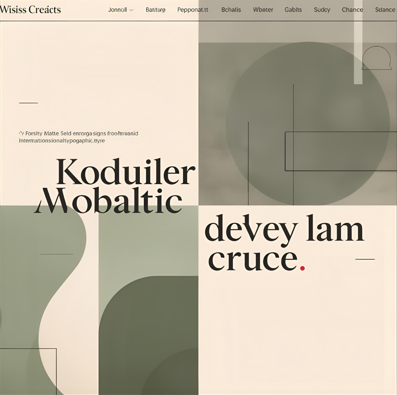
Strategy #1: Be Specific With Art Styles
The biggest mistake beginners make is describing the subject (e.g., “a computer”) but forgetting the style. Instead of letting the AI decide the style (which will result in Purple AI Slop), you should dictate a specific art movement.
Try adding these “Anti-Slop” keywords to your prompts:
- Bauhaus Style: For geometric, clean, and professional looks.
- Swiss Design: For structured, grid-based layouts.
- Risograph Print: For a textured, retro, and handcrafted feel.
- Flat Vector Illustration: For modern, clean app-style graphics.
- Corporate Memphis: For friendly, flat, and colorful business art.
Example Prompt: ❌ Bad: “Artificial intelligence brain background.” (Result: Generic neon mess) ✅ Good: “Abstract representation of intelligence, Bauhaus style, geometric shapes, primary colors, cream background, minimalist composition.”
Strategy #2: Define Your Color Palette (Ban the Neon)
Unless you are selling gaming PCs, you probably don’t need neon pinks. They fatigue the eye and look unprofessional.
To avoid Purple AI Slop, you must strictly control the colors in your prompt.
The Fix: Tell the AI exactly which colors to use.
- Soft/Professional: “Color palette: Sage green, beige, and charcoal grey.”
- Vibrant/Warm: “Color palette: Burnt orange, mustard yellow, and teal.”
- Monochromatic: “Shades of blue, white background, matte finish.”
Pro Tip: Add lighting descriptors like “Natural lighting” or “High-key lighting” (bright and white) to avoid that dark, cinematic, gloomy AI look.
Strategy #3: The Power of “Negative Prompts”
Sometimes, it is easier to tell the AI what you hate than what you like. This is your shield against Purple AI Slop.
If you are using tools like Leonardo.ai or Stable Diffusion, copy-paste this list:
Negative Prompt: neon, purple, blue, cyan, cyberpunk, glowing circuits, hyper-realistic, 3d render, shiny skin, metallic, robot, blur, bokeh, distortion.
Strategy #4: Use “Style Reference” in Canva
If writing prompts feels too hard, use images instead. Canva‘s Magic Media allows you to upload a “Style Reference”.
- Find an image you love (e.g., a vintage poster).
- Upload it to the AI tool.
- Tell the AI: “Create a website header based on this style.”
This is the ultimate cheat code to ensure your visuals never look like generic Purple AI Slop again.
Conclusion
AI is a tool, not a style.
Don’t let the algorithms decide your brand’s look. By spending just 30 extra seconds to define a style, pick a color palette, and ban the Purple AI Slop, you can build a website that looks uniquely yours.
Ready to try it? Open Canva right now, pick a “Bauhaus” style, and see the difference for yourself.
Now that you have fixed your website’s background, make sure your brand identity is polished too. Check out our guide on how to design a professional logo for free using AI.
Pingback: The Ultimate Negative Prompt List: How to Fix Ugly AI Art Instantly - zeroskillai.com